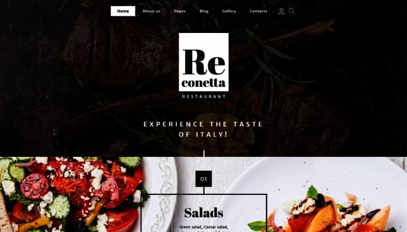
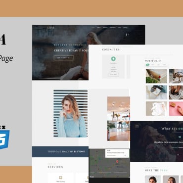
Restaurant branding is different than the branding of any other business. With a restaurant, people enter your brand and sit down, enjoying food, drinks, smells, and experiences which also contribute to your brand. Branding also happens from without, in the conversations that people have about your restaurant, and the web presence you develop. If you are creating a first website, it is important that the template you choose is compatible with the branding already established at your brick and mortar location. Get this one right, and you’ll have created a web experience that is compatible with your overall goals, and which will make you much more successful in the long term.
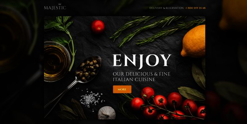
First of all, look for a web template that has your colors and values in mind. The colors might be easy, or they might not. Some people create restaurants with general colors in mind: greens, yellows, browns. For others, the colors cannot be that general, and color hex codes reveal specific shades that must be present in many different places. The latter may be something to aspire to, as successful restaurants around the world incorporate these kind of aspects into everything they do.
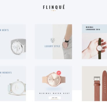
Values are a little less simple to qualify, but should be easy enough when you translate them into design terms. Have you decided on an iPad POS system instead of a traditional credit card system from a small business in your region? If so, it’s likely that you value streamlined modern design elements, ones which you should reflect in the design for your website. Templates you might choose from would be clean, not busy. They might incorporate only a few colors, ideally ones which would incorporate colors you have already made use of in your locations.
If you are working the other way around, from an attractive website to a restaurant makeover, it’s possible to successfully reverse engineer the design aspects that people like about your website. The appearance of both website and physical location should always be harmonious. One good way to do this is to incorporate quality photos of your physical location in the site itself. It’s important to invest in quality in these photos, as poor work tends to make itself apparent even to the untrained eye.
In the end, you should have a physical location and an internet website which complement one another. A person must be able to get the idea of what the experience of the other would be like, after experiencing one of the two. In the end, it’s all about quality. Select a template that is attractive and affordable, which leaves you with the usage rights which you need. In most cases, templates are the most affordable way to develop a quality website, even at their priciest, so consider this option if you can’t afford to work of a reputable designer/developer. If you haven’t considered the branding ideas we discussed above, do your homework on successful brands and try to turn the visual aspects of your restaurant into something that you could franchise, even if you never plan to do so.
