TemplateMonster keeps rolling out updates of its most popular, revolutionary Joomla and Prestashop templates. We were lucky to see how Wegy and Styler got revamped a couple of times each. Today we are back with the review of the features that the versions 1.3 of each of the aforementioned designs have included.

Wegy Update v1.3
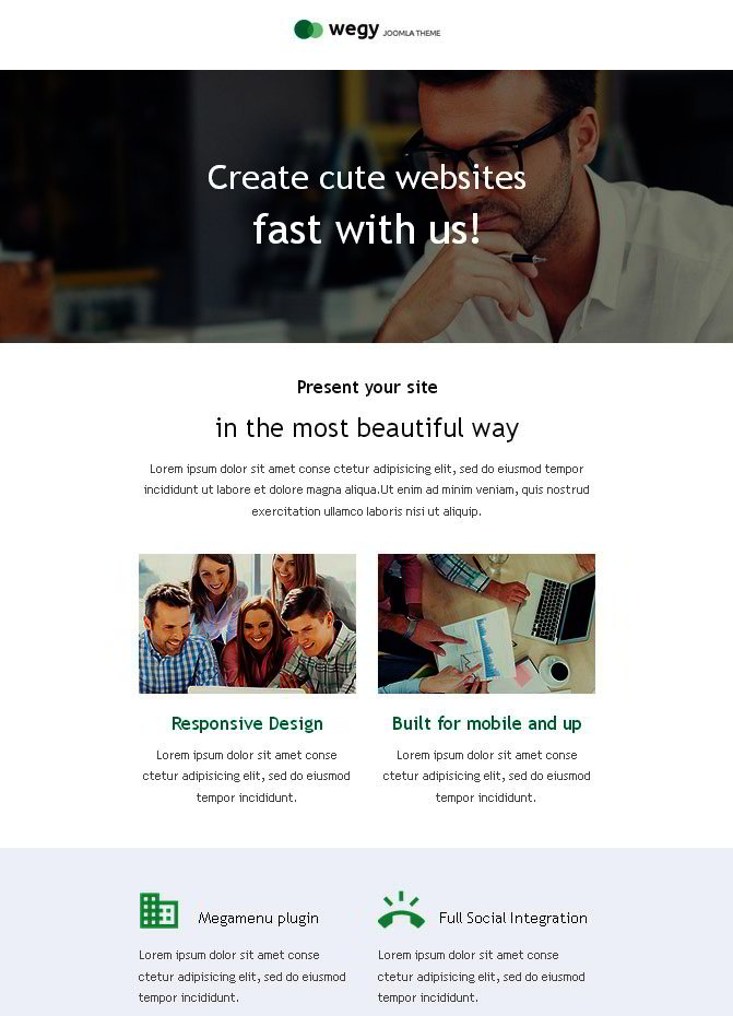
Let’s first dig deeper into what the latest Wegy update has brought. Just like the previous two versions, v1.3 includes more functional filling and new pre-designed pages that make it so much easier to bring your site live in a few days. Most of the new pages from the pack are blog-oriented, intended to present services and about the company information beautifully. There is also a ready-made newsletter template that was designed in a way similar to Wegy itself, featuring its logo and the color scheme. Additionally, the update includes a page loader tool with the logo, which is intended to add a more professional styling to your web resource. Here is how the home page of the updated version of the theme looks like. Follow the respective links to view live demo or see more details.
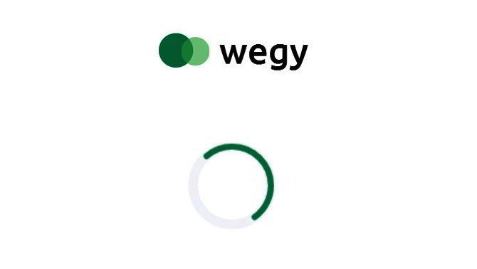
Page loader. Beautifully animated, this element is intended to inform your visitors that the page that they were looking for is loading and they need to wait for a couple of seconds only. With the help of this tool you will not make users sit and stare at a blank page as the content loads. In terms of psychology, chances are that people will stay on the page and wait to see the content rather than leave.
Newsletter theme. This is a cool add-on that the template’s update includes. Together with the standard pack of custom pages that we have got accustomed to seeing inside the theme, you customers will get a ready-made newsletter theme that looks very similar to the Wegy template. The newsletter theme was made easy to read and pleasant to the eyes. It is not content heavy and was designed with the end user in mind. Readable typography, neutral colors, large tiles, vibrant headlines, bold thumbnails – the design includes everything to appeal to the reader. What’s more, it features social media buttons that will take your readers directly to your company’s social accounts.
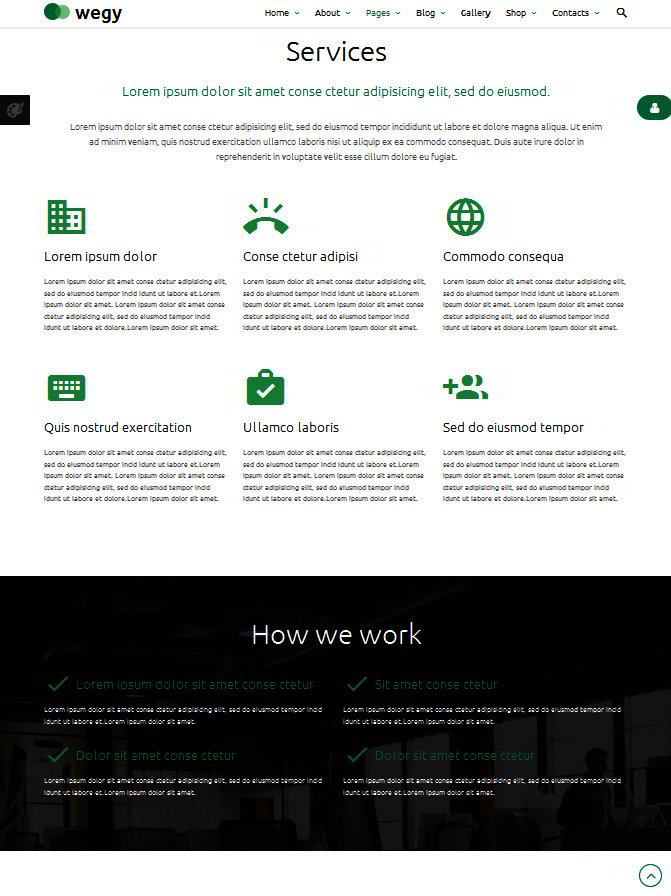
Services page. The third pack of Wegy updates includes a separate page for resenting your company services. For a more impressive presentation, a large background image with parallax scrolling effect was integrated. To make it easier for the visitors to scan through the content, neat icons and large titles were implemented as well. What’s more, there is block for presenting user testimonials placed closer to the footer of the page.
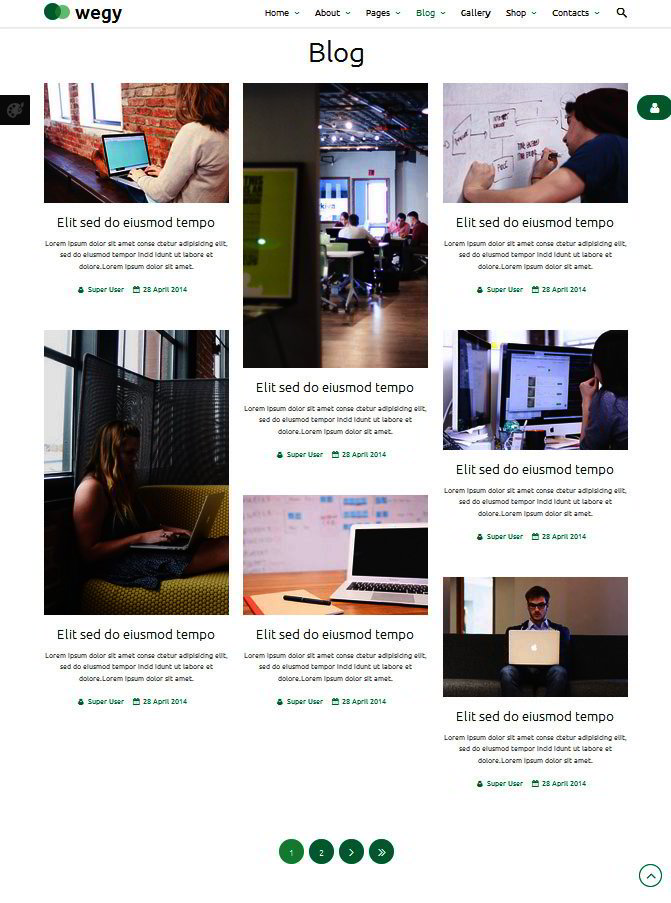
Blog page. The 3rd version of the blog page features content that was organized into three columns. For comparison – Version 1 and Version 2 had a 1- and 2-column structure, respectively. In the blog page version pots are shown in the masonry style, which adds a more elegant, refined look to the layout.
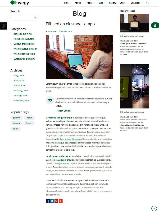
Blog Single Page. In addition to all the aforementioned features, Wegy update v1.3 brings three versions of the blog single page. The first one looks simple and minimalist. Here you can publish your post, accompany it with an image, like and share buttons. The second version of the blog single page includes all of the features of the first one plus a sidebar that lets you showcase the search option, list of categories, archives and tags. The third version of the page includes two sidebars: the left one looks similar to the one of the Blog Single Page. Version 2, whereas by means of the right one you can let users preview the recent posts.
Basically, these were all of the key updates that the third version of Wegy multipurpose Joomla theme included. As a cool add-on, the pack includes an array of functional buttons for quicker social sharing, large tiles, large tiles, and more. Now let’s see what Styler Update Version 1.3 features.
Styler Update v1.3
Similar to Wegy, with its third major update Styler Prestashop theme has got even more powerful. The changelog looks really impressive with all its bug fixes and new functionality. Here is what you can find inside the pack.
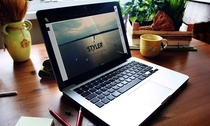
Background video. Still full-width pictures are good. However, a motion background is more likely to grab users’ attention. Styler v1.3 includes an extension that can help you add background videos hassle-free.
TM Category Slider lets you feature your top-selling or new items in a captivating slider at the top of the page. It is fully customizable, giving you the freedom to showcase as many items as you wish, with captions and calls-to-action.
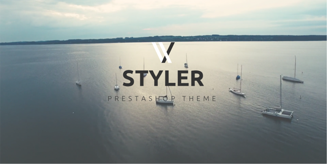
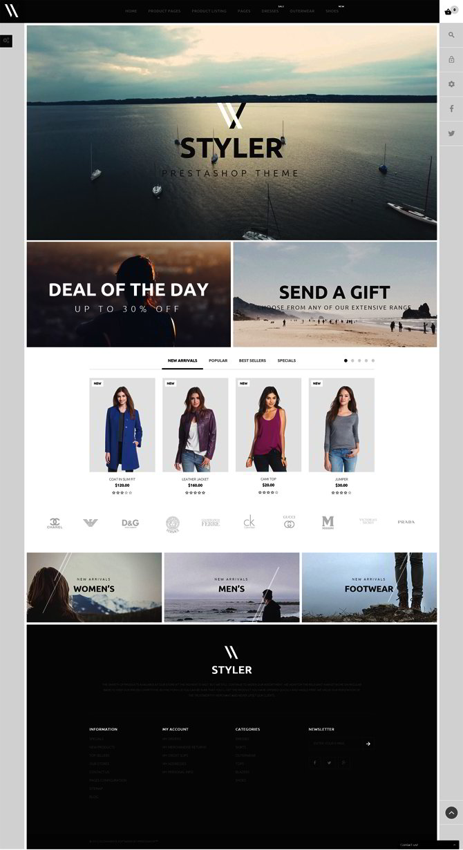
New Homepage. The main page of the theme looks different as well. Now your site visitors will be introduced to a large hero area featuring video background, with the company logo placed on top of it. The first version of the page included a larger header slider, whereas the second one came with a minimized version of the slider accompanied by several product banners organized in a tile-based view.
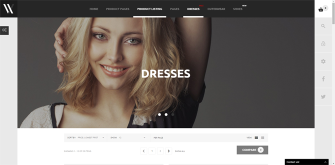
Product Listing Page Version 3 looks more stylish and professional. Product previews feature larger thumbnails. Each item is supplied with the quick view, star ratings, color choice, pricing details, and several calls-to-action. At the top of the listing page, there is a beautifully designed slider that invites every visitor for the deeper investigation.
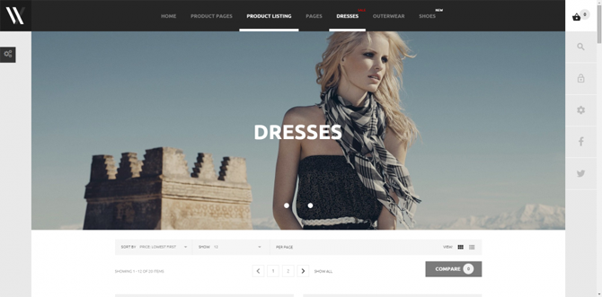
New Product Page. Unlike the previous Styler updates, v1.3 includes a pre-designed product page that is ready to go out of the box. Tabbed navigation, video review, a list of related products, accessories, and other details were provided for the better presentation of each item to your customers.

Similar to Wegy, Styler includes several bug fixes that will make the themes’ installation and modification much easier. According to TemplateMonster’s creative team of developers, the fourth updates of Wegy Joomla theme and Styler Prestashop theme are not far off. We’ll keep you updated on this, so stay tuned!
