The SEO efforts and internet marketing campaigns you do to promote your site can only go as far as bringing traffic to your site. The design of the site, the content you’re serving and the user experience in general are the determining factors that will determine if visitors enjoy browsing through your site.

Of course, there are ways to improve visitor retention rate. Creating attention-grabbing above-the-fold content is the most effective way to go. In this article, we’re going to talk about some of the best ways to fill your site’s above-the-fold area with content that can keeps visitors interested.
Leave Visitors Wanting for More
The easiest way to keep visitors on your site and make them scroll down – or even browse through other pages – is by filling the above-the-fold area with teasers. It is all about keeping them interested and igniting curiosity.
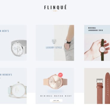
If you’re running a blog, this means adding a big, attractive picture followed by a couple of paragraphs filled with intriguing content or pointers. For e-commerce sites, a promotional offer and a banner that shows some of the latest items in the catalogue usually work best.
The right content to place in the area that your visitors see first depends highly on the audience segment you’re targeting. You may have to do a couple of trials to find the content that really works.
Visual Pampering
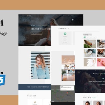
Another great approach to try is to use visual elements to wow visitors the moment they open your site. This is one of the reasons why video backgrounds are becoming more and more popular. There is a strong impact produced when the video background plays for the first time.
Creative agencies like Spiel are beginning to use whiteboard animations to retain visitors. The white background blends nicely to the site’s body, making whiteboard animation very effective for this purpose. A quick explanation of the products your site offers or a tutorial on how to use the services available on the site will work wonders.
For a lighter alternative, a parallax slideshow is also an option worth considering. Unlike conventional banners and animated slideshows, parallax slideshows allow you to animate every element differently.
CMS platforms such as WordPress have their own parallax slideshow plugins you can play with to create awesome above-the-fold content. Some of the themes available here even have a parallax slider preinstalled.
A Strong Call to Action
One last approach to try is to start with a powerful call to action. With a large, light font and a colourful background, you can stop visitors dead in their tracks and make them pay attention. For example, you can place your latest “70% Sale!” offer above the fold and you’ll have no trouble at all converting visitors to customers.
The area above the fold is very important. It is the first thing your visitors see when they open your site. Aside from using the tips we talked about in this article, it is also necessary to make sure that the content loads quickly and correctly on multiple devices.


