There’s nothing more offputting than a confusing, badly organized website which makes it a chore to find and do what you want. In fact, with so many competitors in every niche these days, we would go as far as to say if your site isn’t user-friendly, you’re toast from the get-go.
But what exactly makes a site user-friendly? We visited and analyzed hundreds of sites and came up with the following list of essentials for a user-friendly website.
Building a User-Friendly Website
1. Get to the Point, Time is Money!
If your visitor clicked a Facebook ad, a search engine listing or a contextual backlink from another website, they did so with some sort of expectation.
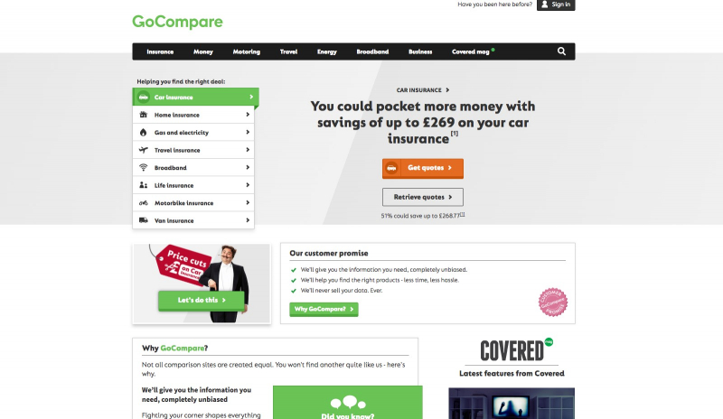
Let’s say, for example, that your website is about comparing car insurance quotes. Do you think your reader wants to read a wall of text on what makes a great car insurance policy or do you think they would prefer a handy tool with a few text fields as possible which they can then click and get an instant price comparison?
It’s easy to figure out which would be more user-friendly – the one which does what it actually leads you to expect before you click through.
If you make your user’s life difficult by making them navigate through several pages before they get where they want to go, expect your bounce rate to skyrocket and your web venture to fail.
Get straight to the juicy stake – websites, unlike dining, do not require starters.This car insurance comparison site – GoCompare.com – is a perfect example of what we mean.
2. Pay Attention to Colour Scheme & Font
You’ve probably heard the term contrast before and it is important when building a website.
You DO NOT want yellow text on a red background unless your aim is to blind your reader. You do want black text on a white background, with some colour in the menus and visuals such as photographs.
It’s also important not to assume your visitor has perfect 20/20 vision. Make the font big enough that anyone can read it and make sure to stick with common fonts like Arial and Verdana.
These may not be exciting but they are used by the vast majority of websites for a reason.
3. Keep It Simple & Minimalist in Design
Have you ever visited a website and been greeted by three popups, for gifs in the menu advertising different products, and a video ad which starts automatically?
There’s nothing more off-putting and your user will bounce away quickly to a competitor’s website if you ‘cram’ elements in. We’ve visited several sites that could induce an epileptic fit in vulnerable users – needless to say, this is not what you are going for.
Think about how relaxing places like massage parlours and yoga studios are designed and implement those realizations on your website. You want to relax your reader and guide them on a journey through your site to where you want them to be.
Cut the clutter, hire a professional web designer at Upwork.com and keep it as simple as possible.
4. Think Menus & Navigation Out Before You Build
We are aware that websites grow, evolve and change over time but the menus which offer your users various options (articles, reviews, products) should not change too much.
This is only possible if you plan them right from the beginning. You should think about what your website is about, list the main site categories, and then keep the sub-menus to just a few in each case.
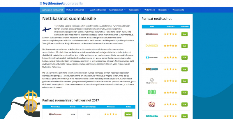
The best menus offer four or five options per category maximum. The last thing your user wants to see is a dropdown menu with 48 different options. This leads them to feel overwhelmed and again, they will click X and go elsewhere.
Look at the menu on the right on this casino review site – Nettikasinotsuomalaisille.com – it’s simple, to the point and has all the necessary information to take the user where they want to go with ease.
Since menus fall into the category of navigation we will also mention another crucial point here – build ‘back’ buttons and make it that your user can find their way back to where they came from on your site if they don’t like what they see.
5. Use Common English a Grade Schooler Could Read
So you have a masters degree in English literature, do you? Guess what – the user doesn’t care and likely doesn’t have one herself.
The actual copy and content of your post on your site will have a huge impact on the overall user experience. You don’t want to greet dog grooming enthusiasts with long, academic sounding sentences or paragraphs of text 20 lines long.
Here are a few quick tips for an effective copy:
- Use simple English – write for grade schoolers.
- Hire a professional writer – it will pay off dividends.
- Spell check everything twice – typos ruin your credibility.
- Keep sentences & paragraphs short – text walls scare people.
- Use images & videos – some people hate reading.
6. Don’t Forget Mobile is Both Present & Future
If your website is not mobile friendly, Google is going to knock you down into oblivion and mobile users are going to click your ads, which you will pay for, and leave your site within seconds.
If you need to hire a professional, it is well worth the investment. Enable AMP pages, optimize load speed, and visit the site on a variety of mobile devices like phones and tablets, testing out the experience for yourself.
CNN.com is a great example of a well-designed mobile site. It’s simple, to the point and mobile friendly. Since mobile users are now the majority online, you have to get with this or get left behind.
Summary
These are just a few tips for getting things started. You will constantly fine-tune, tweak, and edit your site as you go, and that’s a good thing. Running a site is an exercise in endless improvement and development and you will learn much more as you go.
If you implement the above advice you will be off to a flying start and will be ahead of most of the competition.
What else would you say about creating a user-friendly website? We would love to hear from you in the comments!

