In 2019 there is almost no educational establishment without its website. Looking for university, school, or kindergarten may is very challenging if relying only on people’s opinions. So, surfing the Internet to find, for example, the alma mater is a matter of course. But, how many websites did you skip because of impractical design? Let’s see how education website designs can inspire you in such selection. What websites can grab your attention?

What is Web Design Nowadays?
If a design can refer to anything that people project or create, web design has wider intention. First of all, it is one of the most advanced skills a person can master in recent years. It refers to the digitalization of content. It is a selling and the first eye-catching cover of any website and application. To be a web designer, you should be kind of constructor. You can create the surface of the web platform along with its consumer appeal.
How Literature Can Assist You in Mastering It?
Usually, when people found a hobby to do, they seek to collect as many relating materials as possible to master it. Online tools are helpful in a modern pace of life but books are still a relevant source. They give you the first impression of the skill. You can conclude whether it is boring for you or it is worth trying. And, as a student, you just want to rely on a trusted source of information. A professional group of academic writing experts from AdvancedWriters essay service offers a list of literature which can assist you in getting to know web design closer. Check out our top 5 and choose your first book.
- Steve Krug. Don’t Make Me Think: A Common Sense Approach to Web Usability. The book comes in 2 editions. It helps people who both belong to web design or new users to have a common understanding of skill itself. It is easy at reading, and there is no complex terminology a person can be lost.
- Jennifer Robbins. Learning Web Design. One more fount of knowledge for the new users. The book boosts its practical exercises that can help you to get closer to the codes.
- Susan Weinschenk. Neuro Web Design: What Makes Them Click? It tampers you with the fact Susan Weinschenk is a psychologist first. She studied the behavior of web users to show how a website can make you click its content. It is a proper guide to those who are newer to this sphere, who seeks for optimization.
- Brian D Miller. Above the Fold. Once you have your website or have a good knowledge of creating it, let’s know how to make it successful. He speaks of key factors of content success. Also, you can use it as your bedside book to revise the information.
- Jeff Johnson. Designing with the Mind in Mind. It is all you need to know about the user interface. What people pay attention to while choosing it?
Above-listed books are just a first step at mastering web design. Get to know how to gain more knowledge.
What’s the News?
The trends of web design of 2019 do not differ much from recent years. But sticking to basics rather than looking for a new approach is not always bad. Check the top 3 trends which continue to govern the web design side of the Internet.
- The importance of minimalism. Ideal picture is a website that is pastel color and with one sentence in the middle to grab your attention. So that you will spend less time thinking and seeking needed information.
- 3D effects are still with us. Designers try to make the content more visual and comfortable for your eyes. Moreover, 360 projections does not lag behind. There is nothing more appealing than overlooking an item in 360. Or, take a look at the education establishment all round.
- Call-to-action buttons’ personalization. More and more websites introduce a friendly manner of call-to-action buttons. For example, instead of clicking CHECK IT OUT HERE, you may get GIRL/BOY, LOOK HERE or HEY, PRECIOUS FIND IT HERE. The interface becomes more relaxing, and the user may get stuck on the website just to see more such buttons.
What to Do and What to Avoid?
Let’s see in detail which web designs can inspire you. And which can destroy your desire to surf it and click the next one?
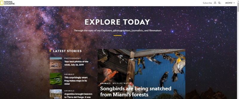
1. National Geographic. Minimalism. The latest stories, along with the pictures.
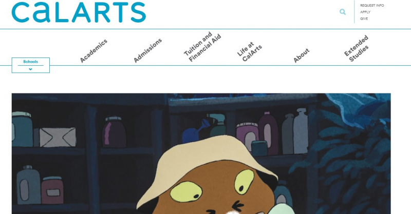
2. California Institute of Arts. Comfortable interface. White background. Interesting visual effects.
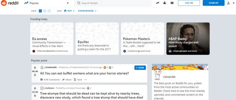
3. Reddit. The platform look-alike twitter. Question-answer style of content. The latest news.
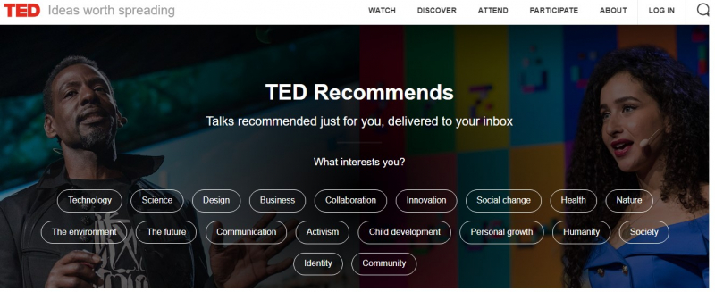
4. TED. Comfortable categories. Call-to-action buttons.
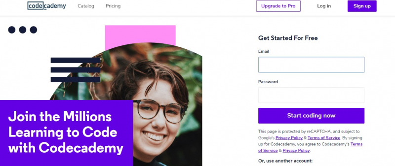
5. Codecademy. Minimalism. White background.\
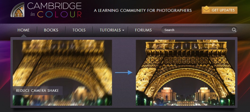
6. Cambridge in Color. Wake up call straight at the front page. Relaxing colors.
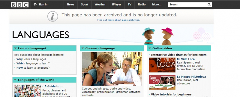
7. BBC. Learning platform. Different categories needed for learning languages.
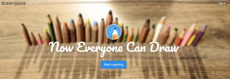
8. Drawspace. Motivational Statement which grabs your attention. Call-to-action button.
9. Udacity. Minimalism. Few categories.

10. My Own Business. Free lessons for future businessmen. Calm colors, comfortable interface.

These are examples of a good hand of a web designer. What is the contrary?
- The websites without any visual attachments.
- Background with too bright colors.
- No comfortable interface.
- Too much text.
Inspiration in Everything You Do
Web Design is a theme you will always come across with. Do not make the mistakes of people who create a website in a few hours. Always inspire yourself with the works of the best ones. Our above-cited materials aim to help you to start your journey with it.

