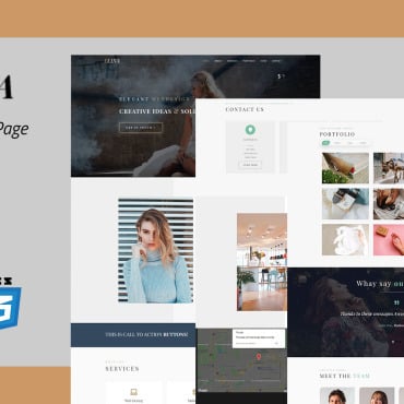
Designing a webpage is like creating a piece of art. In order to be successful, it should stand out from the crowd and make an impact.
If you want to achieve this, you have to consider some key elements when you put together a website. If you have some design style tips at your disposal, creating a beautiful website won’t be as difficult as it might seem.

The five style tips below will help you create a stunning website and make other people excited about it, which will ensure your growth and success.
1. Be clear with your objective
A clear vision will support the creation of a well-designed and purposeful website. What is the purpose or business goal of your site?
If you aren’t sure about that yet, ask the target audience. Your objective should be to attract visitors to the website and promote a product or service, so you have to be specific and clear with the message.
Avoid using confusing words and phrases, or you will puzzle and even turn away visitors.
2. Keep your content short and sweet
The purpose of a website is to tell a story, and the best way to do that is to keep the content short and sweet. There’s no need to write a novel on this kind of website.
The most important thing is to convey to your visitors the essential features and benefits of your product or service. Use simple and easy-to-understand words and phrases in your content in order to keep that goal of brevity with a punch.
If you can do that, visitors will understand what you are trying to convey immediately.
3. Show, don’t tell
This is the golden rule in creating a webpage. Don’t just talk to visitors about what you want them to know; show them what you want them to see.
If you hope to get people to pick up a product or service, or simply buy it outright, tell them what it is and why they should select it. Writing about how great your product is, how it solves their problems, or how accomplished and skilled your team is won’t necessarily do the job.
Visitors need to see how the product or service solves their problems and possibly view your team in action. By showcasing products and services on your website, you can accomplish this.
For example, if you plan to promote a big diamond ring on a jewelry site, rather than just describing the rings, provide plenty of photographs, even video footage, that will sell the ring for you so you don’t have to write much at all.
4. Be consistent with color scheme
Having a consistent color scheme throughout your site is another key design element of an effective web page. While choosing colors, make sure they’re related to the brand and products. Choosing the right ones will require some care.
Use neutral colors instead of bright or dull ones. It’s best to feature hues that are soft and light, but similar to the overall theme.
That way, visitors will be able to read content with ease, understand what you’re trying to say, and develop a positive impression of the brand. Of course, there are exceptions to this; for example, if your brand is something a bit out there, such as an extreme trampoline park or a Halloween-themed business, then the design should reflect that.
5. Use white space on your webpage
A website’s white space is a crucial component. It helps to draw visitors’ attention and creates a sense of vibrancy.
When you design a webpage, use white space to create a more fluid flow to the content. You may also separate content by applying different colors or fonts.
Conclusion
Creating a website can be a lot of work, but it can also be hugely rewarding when you see the results. A website is a great way to promote a brand, attract new customers, and build a business.
Keep in mind that creating a new web page is like creating a work of art. It ought to be original, attractive, and stick out if it’s going to be successful.
These five tips, if you follow these and consult others who can review your site, you should be confident that your site will be successful.


