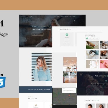
Responsive design is the ability of your website to look and function well on a variety of different devices. These devices include mobile phones and tablets as well as the more traditional laptops and desktops. Responsive design is all about giving the user the best experience possible, regardless of which device they are using to view your website.

60 percent of Internet access is made on a mobile device and 51 percent of emails are now opened on mobile devices. These figures have risen significantly over recent years and this trend is set to continue for the foreseeable future. Google Analytics will tell you what percentage of your visitors are using mobile devices.
It is advisable to take a ‘mobile first’ approach when designing websites. This means to design and code for mobile devices first, then for other devices, rather than leaving mobile design as an afterthought. Your web developer should take a mobile first approach when designing your website.
Web developers are aware that responsive design also has SEO benefits – Google will rank a responsive website more highly than a non-responsive website in search engine results pages. The ideal user experience is for a site to load in less than one second. Aim for this.
It is important to make sure that your branding elements of your website – your logo and business name – are above the ‘fold’ as the user will want to know immediately who the website belongs to. It is important to choose a web developer who is able to do this.

Responsive design helps your online branding by making your site easier to read and use. It’s not just websites that are using responsive design – email is also going responsive. This is important if you have an email marketing campaign.
Responsive design also saves you money – you will not have to pay to update different versions of your website (e.g. standard/desktop and mobile versions). Also, separate versions of the website mean duplicate content, which is penalised by Google and other search engines.
Your responsive website will make your customers happy, and happy customers are more likely to buy from you. They will also tell their friends that they had a good user experience with your website and emails, which will help you to build brand awareness.
Here are five tips for responsive design:
• Use percentages, not pixels. Fluid design is in. This allows the site to render successfully on any device.
• Use images with small file sizes (no PNGs) and get rid of essential content and images. This allows the site to render quickly, improving the user experience and increasing search engine ranking.
• Design for the most popular smartphone screen sizes.
• Use media queries, a feature of CSS3 that allow content to respond to different conditions on a particular device. This is useful as mobile phones and tablets can display content in both landscape and portrait orientation.
• If you use WordPress, choose a responsive theme – there are many available here.
For example – Sample Word Templates is using the outstanding Responsive theme for mobile users.
For brand awareness you should make use of social media, if you are not already doing so. It’s completely free (unless you pay for social media advertisements). Social media sites work well on newer devices as well as laptops and desktops and can be good sources of website traffic. Remember, the goal of your website is to generate leads for your business.
In conclusion, responsive web design is the way forward and has many benefits for your online branding. A well-designed responsive website is an investment that will benefit you for years to come. To invest in a responsive website, contact Magicdust Web Developers here.


