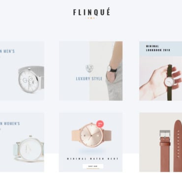
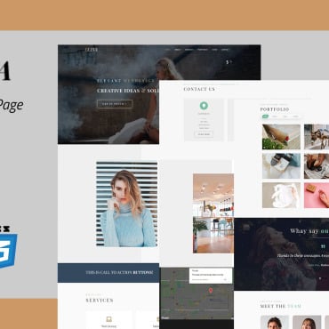
If you are someone who is constantly focusing on creating experiences for your valuable customers, you need to pause for a moment to evaluate your current offerings. Rack your brain to mull over on the most meaningful experience that your digital presence can offer your audience. Like always, you need to study and analyze the basic framework and layout that can actually contribute to enhancing the experience of your users.
The truth is no matter how big or small your business is, you need to break your head over to turn a new leaf and bring the best touch points to your customers in order to compete against the experience.
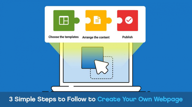
New tools and methods support a plethora of possibilities allowing a brand to create multi-experience to its users. So, to get the show on the road, you need to work on your website elements. It starts right from choosing a good template, arranging the content and publishing your site. Something worth recognizing is that while the ready-to-use templates have become extremely creative, it is necessary to choose the right one that fits well with your business goals.
So, let us see three simple steps that can help you create your own webpage. Choose the templates; Arrange the content; Publish.
#1 Choose the Right Template
Choosing the right template starts primarily by knowing what type of website you are constructing. There are thousands of ready-to-use templates available in the market. Before you pick one, there are few factors that you should focus. Templates are designed catering to different requirements. There are paid, free; there are custom and premium; there are designs which give you the flexibility and few are rigid. Few are responsive, few are visually engaging. So, choose the template by figuring out your business style, your offerings, your audience, your budget and your time. This kind of homework will help you to settle with an efficient and powerful template. Presenting your ideas becomes much easier this way. Spotting is easier. Prioritise the theme by centring your business and audience.
#2 Arrange the Content
This starts by understanding those elements that can power your online presence. Information and images that are visually strong have a greater impact on the visitors. So, if you are running an e-commerce business, then your focus should be on high-quality images, good product description and all those factors that can contribute to enhancing the trust factor.

But, eliminate all that constitutes to the page loading time. Slow loading is one of the prime reasons quoted in the SEO trends and tactics report that force a user to leave your webpage.
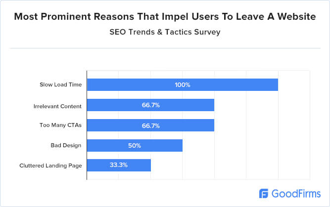
Irrelevant content, too many CTAs, bad design and cluttered landing page are the other reasons that force users to leave your webpage.
An Overcrowded design does not go well with the audience. So, try to avoid them.
If you are running an NGO and looking to make this digitally available for people to access, then your website should focus on elements that underpin your social attitude and simultaneously caters to the requirements of the sponsors. A well documented, responsive and SEO friendly site can create the right impact.

Pick up a template that can highlight humanity, charity and an aspiration to make the world better. Do not include anything that can distract your potential sponsor.
Similarly, if you owning a food, cafe or a brewery business, then pick up a template that comes with a powerful theme, visually engaging and attractive. Carefully structured content and fully responsive information should make the site a hit with the users. Such details can offer an exceptional experience to your users.
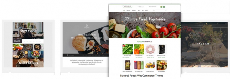
Also, include a comprehensive set of SEO friendly digital marketing tools, widgets, plugins that will assist you to automate your user engagement.
While there is no denying that templates can be a great beginning to your online presence, a lot depends on your customers who demand a more transparent approach.
“You’ve got to start with the customer experience and work backwards to the technology” said Steve Job.
So, pick up elements that your users would actually experience and value. Incidentally, a good layout will definitely help you finish the structure very well. Moreover, a professionally designed template can offer you different potentialities that will work well for your business set-up.
So, take a moment and swipe through the thousands of templates options available in the market and pick the one that reflects your business idea and can contribute to your conversions.
#3 Publish
Once you have finalized on a template, customized it to suit your needs, packed it with all the elements and information, get ready to test run it. Preview your site and check if it speaks your idea. If everything is fine, hit the publish button and go live. Wait for your customers’ reaction and their influence. After all, the experience that you create will set a new standard for your brand. So, be attentive! Focus on improving even after you publish your site.
About the author:
Sophia Jayden is a senior writer and a content marketing specialist. She has 10+ years’ experience in content writing and marketing. Currently, she is a staff writer at GoodFirms, a pioneering B2B research, review and rating platform. For more information about her work, you can reach out and start a conversation with her at [email protected].


