If you know what to ask for, you’re more likely to get what you want; that applies whether you’re developing an online business or ordering ice cream. If you’re doing the former, however, your decisions will affect how potential customers perceive your brand. That being the case, there are a few aspects of web development that you want to get right.

Having a top-notch ecommerce business requires a lot more than just offering quality products or competitive prices; you also need the kind of website that seems reliable, relatable, and intuitive. It is why so many people turn to companies like WebCitz. You can’t DIY your way into a great ecommerce website; it takes professionals to make sure that everything is just right.
That being said, not every ecommerce development company will be able to give you exactly what you need. Many of them specialize in certain sites, for instance, while others are simply bad at doing their job. If you can communicate your requirements, though, it’ll be easier to keep everybody on the same page.
1. Ensure a fast, responsive site
How long will you wait for a site to load before clicking off? If you’re like the average person, it’ll just be a few seconds. Having a site that loads quickly isn’t just a matter of convenience; you need that to retain site visitors.
Many people focus on what an ecommerce site will act like on a laptop screen, but the mobile version of a site is just as important, if not more so – over two-thirds of people use their mobile phones to browse websites. Make sure your site doesn’t just load quickly on larger screens but hand-held devices as well. Plus, user experience isn’t the only thing that improves from a fast website; the ranking will also boost from short load times.
2. Get a web design that matches your brand
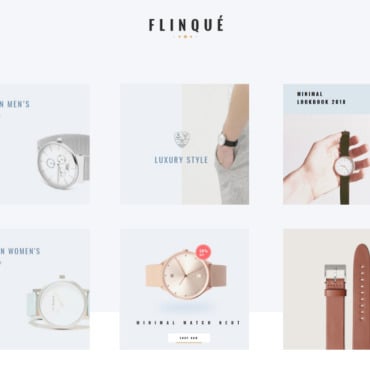
You could be selling high-end perfumes or self-defense flashlights; whatever the case, your website needs to match your brand image. Of course, you’ll want to use design elements like logos or slogans for the actual brand messages, but you also need to create an image in visitors’ minds with the use of unique fonts, color palettes, and layouts.
You want style and substance, sure, but you also need consistency; that’s how you communicate the value of your brand to users. Since your ecommerce site is often the only way people will get acquainted with your brand, the web design should help you put your best foot forward.
3. Use high-quality photo or video elements
Online shopping relies heavily on product photos or videos to communicate the quality of what you’re offering. If the photos are low-quality, the products themselves will seem low-quality too. And this isn’t just about the resolution; it’s about the aesthetic of the photography or videography as well. It’s quite possible for mediocre photos to make products seem boring and cheap, while something as simple as a better photographer could make those same items seem exciting and valuable. Videos can do something similar but with even more potential for communicating a message. That message could be “my product is alright, it’s here if you want to buy it”, or “this is what you’ve always wanted” – you have to make sure you’re communicating the right one.
4. Maintain a visual hierarchy
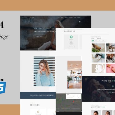
The best ecommerce websites are built so that users don’t even have to think about where they’re going – the layout shows them where to find everything before they even look for it. Here’s the order in which a well-built ecommerce site will display key information:
- A header that contains the business name and brand logo
- Search bar
- Navigation menu bar
- Contact information
- Main image or photo carousel
- Main content or website copy
- Call to action
- Footer
This basic layout isn’t just what people expect to see because it’s on a million other websites; it tells a story, and if you disrupt it, you disrupt the natural progression of information. For instance, you need to establish brand identity before telling visitors how to get in touch. You need to provide pertinent information about your products before encouraging users to take action.
5. Incorporate social proofs
Does your ecommerce site get a lot of love on Twitter? Show that off. Have you been featured in well-known magazines? People should know about it. Adding social proofs is a way to build legitimacy in users’ eyes; if you can prove that other people think you’re great, newcomers to the site are more likely to form that opinion themselves. Here are some examples of what you could include:
- Awards
- Testimonials or customer reviews
- Mentions in popular websites or magazines
- Security certificates
- Social media profiles or follower counts
6. Improve ease of navigation
If you want site users to keep coming back, you need to provide them with a seamless experience – and that includes the way they find what they’re looking for. As an example, say you’re selling prescription sunglasses. Rather than making users search through the entire product line to find the right strength, you should have a filter that helps them locate the exact prescription they need.
It isn’t enough to have a website that loads each page quickly; you also want the user experience to feel seamless as they’re moving through the site. Fast load times are great, but if someone has to click multiple times to get where they want to go, that doesn’t bode well for the quality of their experience. Instead, use search bars, filters, and other navigational aids to help users get around your site with the least possible effort.
You only have one chance to make a first impression, so it needs to be a good one.
If you incorporate the right ideas and designs into your ecommerce website, you’ll be able to build a strong brand, connect with users, and stand out from your competitors.
Mysterio Shopify 2.0 Theme for Fashion and Beauty
If you don’t want to spend time developing a site, pay attention to Mysterio – great, powerful Shopify 2.0 theme that has everything you need for a high converting website. Creative design, call to action buttons, convenient catalog, blog. Work with the theme the way you want to make your site unique. Mysterio has a clean and modern minimalist design. Perfect for professionals who want to effectively show their store online. As the name suggests, the site template is ideally tailored for eCommerce. Mysterio is another amazing template that offers multiple design options to create an online presence for different types of businesses. With it, you can build an online store or even a blog, if necessary. In general, you can be sure that the future site will definitely not leave anyone indifferent.


