Logos are essentially the first impression that visitors have of any business. So, they need to impress, look good, and say something about your business. In this post are great tips for designing an awesome logo for your site.
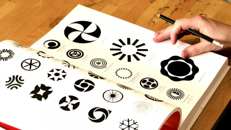
Keep it simple
Your logo should be as simple as possible for it to be effective. If your logo has too much going on, it might be distracting for your audience, and it will be difficult for both your potential and existing customers to recognize and get acquainted by it. A design that’s too flamboyant might be too much for the focus of your audience, and it could take away the core objective of the logo considering that it’s a representation of your brand.
So, whether you want to redesign an old logo or you’re designing a new one for your new company, always keep in mind that the main purpose of a logo is symbolizing the brand, and it’s crucial to use a clean design and make it as appealing as possible. Ensure that your logos appear as they should, and have a duotone – black on white background and vice versa.
Consider Windows for instance. Although the brand has undergone multiple logo redesigns over time, their current logo is just a modernized version of all the logos that have come before it. And as you can probably tell, the new logo is perhaps their simplest and cleanest design yet.
As a brand that was founded in the early days of the digital age, the current logo still embodies their vision and spirit. Its simplicity, the digitized look, and its feel are a perfect representation of the brand as it is today. And if you study how the logos have evolved over time, you’ll certainly notice some of the original branding elements in the current logo.
Aside from the design being easy on the eyes and the quick brand recognition, keeping a simple logo design is very important when it comes to its use on different places and materials, which comes into the picture in the next point.
If you’re interested in creating a logo in an affordable manner then Designhill have a fantastic logo maker that can do all of the work for you. The software uses your information and AI to create quality logos that impress at a significantly lower price than a designer.
Consider Where You’ll Place the Logo
While in the process of designing a new logo or redesigning an already existing one, it’s good to always think about where it’ll be used and how it’s going to appear. From poster boards to onsite elements, it’s crucial to consider how the logo will appear both online and offline.
Consider Uber – a peer-to-peer ridesharing company, a transportation network, a food delivery service, and a taxi-cab company. Recently, they redesigned their logo in a way that depicts the “story” of the brand more accurately. Considering that much of their customer base uses the Uber app, it’s highly likely that the company focused a lot on how their logo would appear on both the app itself, as well as different kinds of screen sizes.
Failure to contemplate on the future use of your logo could set you up for many difficulties later on. If you intend to place the logo on large billboards, small business cards, or even on the side of delivery trucks, it’s crucial to consider how the logo will appear on each of these platforms. That’s because something might look awesome on a business card, but fail to render well when put on a large billboard. As such, it’s important to take your time and think about how the logo will appear on the different platforms before you settle on a final design.
Update Your Logo Periodically
Unfortunately, even the most well-designed logos don’t last forever. To make sure that your logo stays up to date, it’s important to consider making a few tweaks to its design to keep up with the times. Nonetheless, if your logo has been successful so far, it’s advisable to not make any drastic changes to the already excellent design. Sometimes, using a more elegant, cleaner icon or changing the typeface could be all it takes to keep your logo current.
If you want a new logo for your brand or business or you want to re-brand your business, do your best to find the perfect balance. If you choose to work with the right designers and brand marketers, you can easily find the perfect blend of both the existing logo and a newer, modern design that evokes a fresh look and feel.
For instance, the Marriott Hotels recently modified their renowned logo to something a bit more in line with the current times. Their redesign of the logo is a perfect example of how to find a good balance between the old and the new look. You’ll notice that they kept their iconic “M” font style but changes the rest of the text from the traditional red to black. And while the new changes didn’t make drastic changes to the previous logo, they added a modern touch.
Consider using a Timeless Design
As mentioned above, a logo design will eventually feel long overdue for an update. As such, when changing your logo, you don’t want it to be as a need of change because it’s completely out of date. As a rule of thumb, always avoid using things and styles that are currently trendy, since they won’t last forever. Sadly, there are so many brands who still go for the trendy designs and then end up regretting their decision over time. This can be one of the costliest mistakes you make for your brand.
If you go for a design that’s trendy other than something with some longevity, be rest assured that it will only be trendy for a given period and it might not fit the values of your brand. There’s also a good chance that there will be lots of other brands out there spotting a similar design.
Even for those who are not redesigning but are starting a new company and want to design their very first logo, it’s still best to go for a clean, timeless design. However, this is not to say that your logo should lack a modern feel and look. No. Just avoid the design elements that are trending because they will eventually get out of style sooner than later.
For instance, our company’s logo is not only simple, but also effective at conveying our brand’s message. The color scheme essentially fits our branding strategy and the tagline “your partner for digital growth” serves to inform potential clients about our business values. The logo looks modern and timeless – it’s not based on any trends that were popular one day and invalid the next.
Follow the Right Process
When you begin designing a logo, it’s important to follow the right steps to ensure that your design has the potential to drive the brand recognition of your company more effectively.
Our logo design process ideally starts with a kick off meeting where we get to understand the purpose and objectives of your re-branding or branding project. We then conduct a logo exploratory procedure, where we identify and pull together logos from some of the most successful brands across different industries, and have you choose the ones you find most appealing. The main aim here is to observe the reaction of the client and know which designs capture their attention and interest the most.
From there, we research and produce different logo designs based on the findings. We like to create a number of “word clouds” to help us understand what each of the logos embody, and then do some research to find out more about how each of the phrases and keywords looks like to the average user.

