The Concept, First of All
Sometimes we face strange orders: when, without a name or an initial idea of their own business features, startup owners turn to us for help in creating a logo. We would like to emphasize that we do not have anything and do not have a separate logo. Let’s predict this process: it is impossible to execute, and simply like senseless wanderings in the dark.
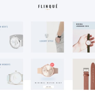
Visual-conceptual creation of a brand is a responsible and important step, which should occur consciously and with minimal preparation. It is necessary to determine from the very beginning, for what consumer your product (services) will be produced, on what segment of the market it will be aimed, where it will be sold, what for signs will become its main feature, etc. Red point of the logo of this hotel deals website is one of such features, as an example.
To the development of the corporate identity of the company it is necessary to approach thoroughly: to be engaged in the creation of a name, a logo, all advertising strategy should one command of copywriters and designers (as a rule, similar services are ordered by the package decision in concrete branding agency).
Idea and Graphics
So, you have developed the semantic core of your brand and, hopefully, you have designed it properly (made a map of text associations on paper or PC). Now it’s time to move on to visualizing your concept.
Choose the top 10 most accurate definitions of your business. Place some kind of schematic image like this around each of these:
Law office→”protection”→ shield, sword;
Law office→”power of law”→foliante with laws, scales, Themis;
law office→”bureaucrat”→ wig, judge’s hammer, tie, feather, etc.
Throw away the most obvious of them – the same shield and scales, looking at you from about half of the logos of various legal consultations, bar associations, and law firms.
Leave five of the most interesting solutions – this is quite enough for the development of such an element of the corporate identity of the brand as the logo of the company.
And Finally, Fonts
Remember that you had five great ideas for your logo in your tanner? – it’s time to work them out! Your task is to design the proper style and shape of the logo, find the right font and color combination.
Here you need to watch, on the one hand, to stay in the trend, look clear and expensive, and, on the other hand, to differ qualitatively from their competitors. This will help you to professional skills (their own or invited designer), taste, sense of proportion and, of course, life and professional experience.
Work on Mistakes
The process of logo development is seldom rapid and one-act: there are usually multiple ostinatos, modifications, changes, changes, etc. Therefore, the testing stage should not be excluded from it.
On it, the logo is checked both in terms of meaning and visual form. First of all, its adequacy is considered by customers and business owners; then an initiative group consisting of your potential audience (at least 20 people) is formed. Considering the proposed logo, they share their impressions and doubts, and you notice the constructive criticism and make appropriate changes in the final design layout.

