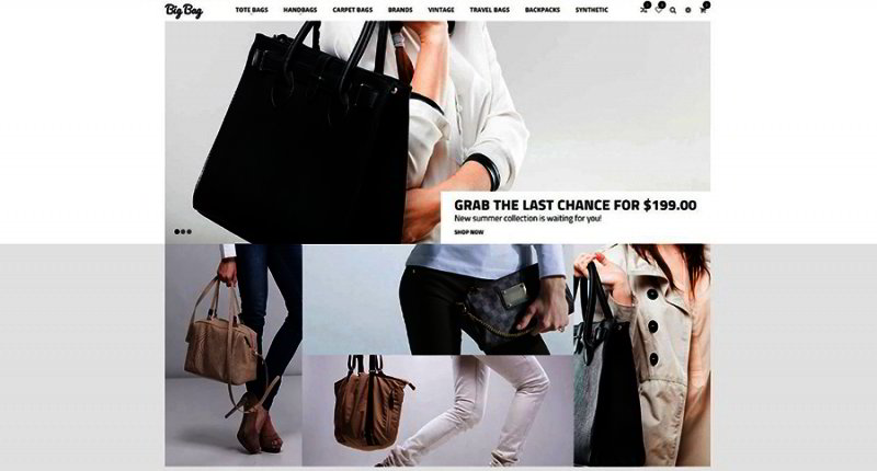
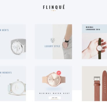
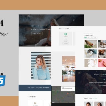
Great products are not likely to sell with just any website design. The average internet user will probably spend more time on websites that have a high-quality template.

It has become a necessity for any business to engage in e-commerce. In today’s internet age, people increasingly want to have the best products in just a few clicks. They may want to purchase products online such as gadgets, books, or even website designs.
If you’re still building your website, you might want to browse these guidelines to ensure your site design could attract and convert visitors:
Purposeful Pages
Each of your web pages should have a clear purpose. For instance, you may have separate tabs for ‘News’ and ‘Promotions.’ The content of each page must be concise and fulfill the needs of users accordingly. This will ensure that customers are satisfied with every click.
Organization
Great content in websites can easily be dampened due to poor organization. Since users of the internet prefer to view websites quickly, clear communication is important. You can achieve this by organizing your content according to bullets, headings, and subheadings. This will ensure that users will be able to digest information conveniently.
Color Scheme
A color scheme consistent with your site’s theme is essential to creating the best experience for your customers. Choose colors for your site that blend well with your business’s logo. Also, avoid using vibrant colors unless you want to evoke the emotions of your audience. Lastly, the colors of the text should sharply contrast to the background color to maximize readability.
Relevant Imagery
Images can effectively substitute a paragraph of plain text when chosen well. Choose images that align well to your website’s design. Quality images may not be free to use. Consequently, you may consider using free stock photos or videos. These are full-proof methods to instantly communicate to your audience in a short span of time.
Ease of Navigation
Users want to do business with websites using as little clicks as possible. Ease of navigation should be a priority for any e-commerce website. Methods for creating easier navigation include designing ‘page hierarchies’ for instant access to content. Alternatively, you may wish to use the ‘three click rule’, which means users should find the content they seek within only three clicks.
Mobile Friendly Site
A good number of users view websites through their tablets or phones. Thus, you have to make sure that your website is mobile friendly. There are two ways to do this. You may either reduce your website’s width to fit into the user’s mobile screen or create a separate mobile website.
Conclusion
There other professional services that ensure your e-commerce sites cater well to your customers’ needs. One these is ORO CRM. It allows you to control how you manage with your site’s customers effectively.
Ultimately, you will have to decide whether to modify your website’s design on your own or to avail of professional services.


