The world of web design is constantly evolving and new trends are emerging every year. With 2023 just around the corner, it’s time to take a look at what web design trends are expected to dominate in Europe over the next couple of years. From emerging technologies to updated UI design, here is a look at what to expect in European web design trends for 2023.
Photo by Campaign Creators on Unsplash
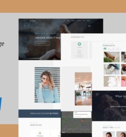
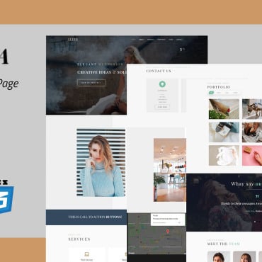
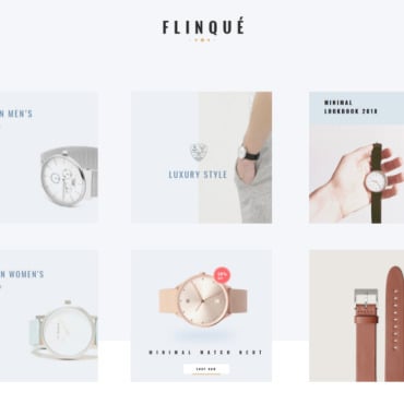
The rise of minimalism
Minimalism is a trend that has been gaining traction in the web design industry for some time now, and it looks like it will continue to be popular in 2023. Minimalism is all about keeping things simple – the idea is to focus on the content while keeping the design elements to a minimum. This type of design strips away the clutter, making it easier for users to focus on the key elements of the page. Minimalism also helps to create a modern and sophisticated look, which is ideal for businesses wanting to present a professional image.
The return of skeuomorphism
Skeuomorphism, or the use of visual metaphors to represent real-life objects, is making a comeback in web design. This trend has been popular in Europe for years, and it looks like it’s here to stay. Skeuomorphism is characterized by realistic visuals and textures. And it is often used to give a sense of familiarity and comfort to the user. One example of skeuomorphism that has recently become popular is the use of 3D maps. Maps are a great way to illustrate information visually, but they can also be used as part of a design aesthetic. 3D maps add depth and texture to a website, allowing users to virtually explore and experience locations such as Greece and explore the best vacation packages in Greece.
More use of animation
In 2023, we can expect to see an increase in the use of animation in web design. Animations provide a dynamic and engaging experience for users, which makes them more likely to stay on the page and interact with the content. It can also be used to add visual cues and context to websites. That helps users understand what they’re looking at and where they should go next. Animations are also a great way to add personality and create an emotional connection with users.
The rise of dark mode
Dark mode is a growing trend in web design, and it doesn’t look to be going away anytime soon. Dark mode is a design technique that switches a website or application from a light background to a dark background, typically with lighter text and icons. This mode has been steadily gaining popularity over the past few years due to its potential to reduce eye strain and save battery life. Dark mode not only helps users conserve battery life, but it can also improve overall legibility on a web page or application.
Use of duotones
Duotones are becoming increasingly popular in web design in Europe for 2023. They are a combination of two colors that work together to create a unique and stylish look. This technique is often used to create depth, contrast, and movement on a website, as well as to provide a modern and contemporary look. Duotones are also great for adding vibrancy and energy to any website.
